You know what’s one of the hardest parts of digital marketing?
Reading reports like this:

After painstakingly creating content, building lead magnets, optimizing forms, and ultimately capturing subscribers… Sometimes we lose them.
We pour a lot of work and money into something that can vanish at any moment.
Occasionally unsubscribers give a reason, but usually they leave our tribe without a word or complaint. In either case, there’s nothing we can do about it.
Well, that’s not entirely true…
We can’t stop their fingers from clicking “unsubscribe,” but we can create emails so engaging our subscribers look forward to reading them.
Below are the six keys to a successful newsletter. As you go through the list of examples below, keep an eye out for each quality. Use these as a checklist for your own newsletter too!
1. Provides Tremendous Value
90% of your content should be educational and entertaining. Only 10% should be promotional. If you push your products and services too often, your readers will unsubscribe.
2. Creates Exposure Opportunities
The mere-exposure effect tells us that repeated interactions with a brand prepare people to make buying decisions. Every time your subscribers open an email, they become a little more receptive to your offers.
Essentially, this means you have to find a balance. How often can you send without upsetting your subscribers?
3. Collects Micro-Yeses
Through little commitments (clicking links), newsletters instill a habit of taking action when your subscribers encounter your brand. Think of it like priming your subscribers for when you request the macro-yes.
4. Builds Trust and Authority
Your subscribers need to know that you’re a solution provider who has the answers to their problems. Even if they don’t take action, your emails will still help them associate you as someone who can solve their problems (on that topic).
5. Grabs Your Subscriber’s Attention
The subject line is the first interaction your subscribers have with the email. Its single goal is to get them to open. Craft subject lines that grabs their attention.
Short subject lines work best. Campaigner’s 2012 Email Marketing Metrics Report discovered that subjects with less than 15 characters maximize your open rate, and subjects with 28-39 characters are best for your click rate.
6. Calls Subscribers to Act
The best emails have one primary call to action. You might have multiple links, but there should be an obvious path forward that deepens your relationship with the subscriber.
The call to action depends on the email’s purpose. If you’re announcing a new blog post, the call to action would link to the post. If you’re just trying to deliver value, the call to action might link to an interesting article or video.
Or, your call to action might push the relationship down your funnel – perhaps to a webinar, a strategy session, or a page to purchase a product/service.
Don’t have subscribers yet? This free guide is packed with actionable and effective ways to turn your readers into subscribers. Click Here to Download
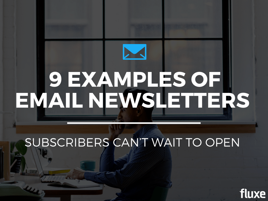
9 Examples of Quality Newsletters
Today I’m unpacking nine newsletters we find especially valuable and effective.
Each newsletter doesn’t meet every qualification listed above, but they don’t have to. There will always be some variation depending on the audience, product, and author. Use these emails as inspiration to craft your campaigns.
Let’s jump in!
1. Community.is
Community.is (created by Loyal, an agency that builds communities) is a “weekly, handcrafted newsletter for anyone who puts people at the center of their work.”
Originally it discussed topics on community building and nurturing. Today it curates an eclectic mix of content about technology, customer experience, design, and human interest.
Why We Love It
- Excellent copy. For instance, see the first line in the pictured email: “Have you ever found yourself revealing more in a meeting than you intended?”
- Organized content. The “short,” “mid,” and “long” tags offer content to different types of readers around the same topic. If you only have time to read the email, the short section is for you. If you have more time, the long section contains a link to a detailed read.
- Strong visuals. Those may be stock photos, but they’re chosen carefully to support each section’s content.
- Useful links. The “Loyal’s Links” section creates multiple opportunities for readers to click and find something valuable.
2. Brain Food
Brain Food is a weekly digest by Farnam Street, a consultancy “devoted to helping you develop an understanding of how the world really works, make better decisions, and live a better life.”
Brain Food specializes in deep and weighty content, as opposed to what they call “mental fast food.” (Check out some of their best articles. These are deep.)
Each week, they distribute everything they’ve posted, book recommendations, recent insights, and curated content from quality sources. Topics include philosophy, psychology, and human behavior.

Why We Love It
- Immense value. If you enjoy deep reading, you’ll love this. Their emails are far deeper than most newsletters, but they conveniently separate the most important content into the “Start Here” section.
- No gimmicks. If you don’t like their email, they encourage you to unsubscribe. There’s a call-out box at the top you can’t miss with an unsubscribe link. That’s refreshingly honest.
- Low commitment. While pushing subscribers to take the next step is great for businesses, subscribers love emails that prioritize value and ask nothing of them.
- Easy to consume. By pulling out the most important quote from each link, the author gives you the opportunity to explore the link before you click.
3. 5 Bullet Friday
Tim Ferriss is well-known for his thoughts on productivity, self-improvement, and well-being. If you haven’t read the 4-Hour Work Week, it’s worth your time.
Tim’s weekly newsletter is short and concise. He doesn’t bore you with unnecessary words.
Each edition contains the five coolest things Tim learned that week, including gadgets, products, music, quotes, supplements, hacks, articles, and (truth be told) some pretty weird stuff.

Why We Love It
- Easy to consume. You can read Tim’s emails in less than a minute. Nothing gets in the way of his lessons.
- Low commitment. While Tim plugs a product in nearly all of his emails, the product is rarely the focus. In the image above, you’ll notice a call to action for his latest book, but he’s just as happy if you click any interesting link in the email.
- “Hi All:” In most cases, a personalized email is best. But Tim has gone to great lengths to build a community, so phrases like this make people feel included.
- Tested advice: Tim only recommends products, tools, books, food, music or events that he’s experienced himself. If he suggests rock climbing, it’s because he’s gone rock climbing.
4. Jenna Kutcher

Why We Love It
- Easy to consume. Jenna’s emails are simple, but valuable. They focus on one topic and don’t ask much of your time.
- Superb copy. Jenna’s copy is simply excellent. She has personality, but she’s not over-the-top. She connects emotionally and sells her credibility without boasting about her accomplishments. Most importantly, she’s not afraid to get personal.
- Perfect on mobile. Simple text emails without images display perfectly on mobile devices. This is important because (depending on your audience), up to 75% of email opens happen on mobile devices.
- Lots of freebies. Jenna’s emails often include free (but premium) content, like guides, mini lessons, course updates, and advice.
5. Austin Kleon
Austin Kleon is a writer and artists who helps other writers and artists succeed. Every week, he sends out ten links worth sharing. He boasts an impressive 45,000 subscribers.
What we like about Austin’s emails are their simplicity. Each email includes an eye-catching image and a numbered list of interesting things. That’s it.
But he links out to some pretty deep stuff. Not your usual “6 tips to…” posts. And not everything he curates is about writing and art, but it’s still relevant, because he knows what his audience wants.

Why We Love It
- Unique imagery. Austin is an artist, so each email contains a well-chosen image that supports the email’s theme. Sometimes the image is custom-made (digitally or photographed). I’ve opened his email just to see his featured images.
- Fantastic curation. Austin curates far more content than he creates, but he doesn’t just blast out links. He adds light commentary that puts it in context for his audience of writers and artists.
- Easy to consume. Austin’s emails lack unnecessary design elements. He uses an obvious MailChimp template, but that makes sure his emails work on all screen sizes.
- No hard selling. The end of his emails include links to purchase his work, and you will find Amazon affiliate links when he recommends a book, but you rarely find any in-your-face selling techniques.
Awesome newsletters deserve to be seen by a big list. Use this free guide to capture your readers! Click here to download
6. The Stimson Group

Why We Love It
- Enticing subject lines. Tom is adept at drawing you in with his subject lines. Some examples: “Praise for Car Salespersons (Again),” “Price Shoppers Are Right,” and “How Was Your Meal?”
- Value-packed copy. Tom’s body copy contains tons of value for his subscribers. Some of his messages could be their own articles. You only need to read one email to be absolutely sure he knows what he’s talking about.
- Smart funnel optimization. Tom pushes his subscribers further down his marketing funnel by inviting them to his monthly web conference.
7. Daily Carnage
Carney is a high-end advertising agency that produces The Daily Carnage, a “handpicked list of the best marketing content delivered to your inbox each day.”
At first glance, The Daily Carnage looks like a typical newsletter. It has a modern design, colorful images, and trendy buttons with gradient backgrounds.
But it has two unique features that make it stand out from other agencies.

Why We Love It
- Generous synopses. Most brands announce their latest blog post or podcast episode with a headline, a few lines copy/pasted from the page, and a button. Daily Carnage, however, gives a detailed introduction and a bullet list of interesting points to draw you in. You could rely solely on the email content. But once you’ve read it, you want to read the rest.
- Ads from the past. I find this section especially unique. Each issue includes an ad from older generations. These make me appreciate how far design and copywriting have come. Even though Carney’s newsletters are quite long, this section could use a little context to explain why the ad worked or what could be better.
8. Out of the Cave Media
Out of the Cave Media is a relationship marketing agency. They help their clients build a culture, brand identity, and voice, and then communicate all that to their customers.
It makes sense, then, that their own brand would have a distinct identity. We can see that in their newsletter.

Why We Love It
- Tons of personality. Out of the Cave Media packs personality into everything. They put their witty humor in their headlines, body copy, images, and even their buttons. It’s remarkably consistent, even in places you wouldn’t expect it.
- Simple, but clever design. They’ve used basic elements (lines, colors, headings, and buttons) to create a classy look without sacrificing readability or functionality on mobile.
- Value. After all that personality and style, they don’t forget to add value. Their top section is full of useful information.
9. Fluxe Newsletter
Not to toot our own horn, but we get a lot of compliments about our emails.
We used to send a typical newsletter – a weekly collection of content, strategies, tools, and opinions. Recently, however, we changed to a simpler format.
Why the change? We discovered that most people only interacted with one component of the newsletter. They rarely clicked links in two or more sections.
That taught us that most people weren’t experiencing the full value of our emails.
Since we value experimentation and testing, we tried a new format. We now send more than twice as many emails, but each has a single focus.
A few other things changed as well:
- After the fourth email in the new format, our open rates and click rates have risen.
- Compliments have rolled in (we got them before, but the frequency has increased).
- Unsubscribes have plummeted. (We didn’t have a serious unsubscribe problem. We averaged about two or three per email. Now we get zero.)
Here’s what today’s newsletter looks like:

Pretty simple, right? That’s the point. That’s what our audience wants.
Why We Love It
- Personal and conversational. I write our emails from one person to another. In many emails, I explicitly ask my subscribers to reply. I respond to them all.
- Comprehensive. Each newsletter only discusses a single topic, so I can dive deep into that topic without producing a giant email.
- One call to action. My emails have one call to action. I don’t want to confuse anyone, so I only give them one path to follow.
- Enticing subject lines. I focus on creating subjects people want to click. After all, if they don’t open, the email’s content doesn’t matter.
- Plenty of media. I don’t overburden my emails with images, gifs and videos, but I include something visual in almost every message. But no stock photos. All of my media serves a purpose.
Great Newsletters Come from Testing
Taking inspiration from great newsletters is a good place to start, but don’t let “best practices” or “heuristics” hold you back.
If there’s one piece of advice to take away, it’s this: Always test.
Test subject lines, copy, images, calls to action, delivery times, personalization, and segmentation. Discover what your subscribers want so you can give it to them.
Admittedly, it takes time to get the data for all that. In the meantime, these examples will help you get started. :)