When we talk with business owners, we hear a common complaint. They have a trendy website with all the best features, but it doesn’t generate any sales.
What was supposed to be a marketing asset just… sits there.
The website looks great, but it focuses on the business rather than the value visitors are looking for when they arrive.
Essentially, it’s just an online brochure. And that begs a question… What is a lead generation website?
Powerful marketing websites that support your business goals are built around the customer. They’re packed with value and optimized for lead generation.
In this post, I’m going to outline the differences between brochure websites and lead generation websites.
I challenge you to examine your own site to determine which category it falls into.
What Is a Brochure Website?
Essentially, brochure websites are like expanded business cards.
They were popular in the early 2000s when it was a big deal to have a five-page, business-focused site. The internet was young and we all built websites like glorified phonebook entries.
A brochure website’s only purpose is to provide legitimacy and basic information about a business. It doesn’t serve any goals because it doesn’t play a role in the marketing strategy.
A brochure site typically has a handful of pages, all of which can be accessed through the top menu or footer. The only information found on the site focuses entirely on the business (not the customers), and is typically limited to these pages:
- About Us (company history, values, mission, team, etc.)
- Contact Us (phone number, email address, and contact form)
- Locations (physical addresses and maps)
- How It Works (for businesses with processes or systems)
- Pricing (if pricing isn’t straightforward)
- Portfolio (samples or external links)
This limited, self-centered nature means the website poses a few problems for any company that expects their site to assist in marketing.
Now you know the answer to the question “what is a brochure website” – you can figure out if you’ve got one.
1. Poor search engine performance
Google has made it abundantly clear that consistent, quality content is important to their algorithm.
If you want to rank well for the right keywords, you must regularly publish keyword-optimized pages that appeal to web users. Great content also secures backlinks, which is another important component of SEO.
A brochure website with no content strategy doesn’t come close to meeting Google’s standards. If the website has only a few pages, there just isn’t enough “meat” for search engines to evaluate.
And since the pages only relate to the business (“About Us,” “Portfolio,” etc.), there’s little reason for other websites to link to them.
2. ROI can’t be measured
A website is a marketing asset that should play a role in a bigger strategy, usually to collect leads. Naturally, you would want to evaluate its effectiveness.
A brochure website can’t calculate the return on its investment. It doesn’t drive traffic to a particular conversion, so there’s nothing to measure. (Most brochure website owners typically fail to install a measurement tool anyway.)
3. Poor audience targeting
Web users are looking for solutions to their problems. They want information and guidance, not advertisements. The only people who find a brochure website organically are people who were already looking for it.
Brochure websites rarely provide the type of information people seek because they aren’t created with an audience in mind. They fail to engage and educate the user. The site’s pages are mostly self-promotion. Brochures serve the business, not the customer.
4. No funnel activity (meaning no sales)
A funnel is a representation of how users interact with your business. Web users (the top, wide end of the funnel) visit your website, but only a fraction become customers (the narrow, bottom of the funnel). Each page should nudge visitors toward your goals.

A brochure website doesn’t funnel users anywhere. Even if brochure sites received a ton of traffic (they don’t), that traffic wouldn’t know where to go. Users might poke around aimlessly, but if they don’t find solutions to their problems, they’ll abandon your site.
If your brochure website is struggling to perform, you can overcome these challenges by building a value-focused lead generation website
What is a Lead Generation Website?
A lead generation website is about the customer. It’s not about you or your business.
“The difference between a lead generation website and a brochure website is a matter of attitude,” says content marketing specialist Charlotte Jenkins. “It is the difference between putting your customers at the center of your business or yourselves.”
A lead generation website plays an active role in encouraging users to move through your marketing funnel to become customers. Put another way, it’s built around a lead generation strategy that converts website users into warm leads.
It has lots of pages that attract new users (often done through a blog) and elements that drive users down the funnel.

To build your own funnel, consider the actions you want your users to take. Each page should push users in that direction. For example, you would want a blog reader to give you their email address. So each blog page should offer something free in exchange for their subscription.
A lead generation website doesn’t have to cost thousands of dollars. In fact, it doesn’t even have to be attractive to be effective (but a nice conversion-focused design helps). But it should have these important elements.
Now you know the answer to the question “what is a lead generation website” – you can figure out if you’ve got one.
If you don’t, read on to transform your brochure site into a lead generation site.
1. Optimized Copy
Your copy should be optimized for people, then Google (in that order). Always use language for humans, but cleverly include keywords that your customers use to search for you. Those keywords need to be used in the right places so Google knows how to rank your site. (Backlinko has an excellent guide on that.)
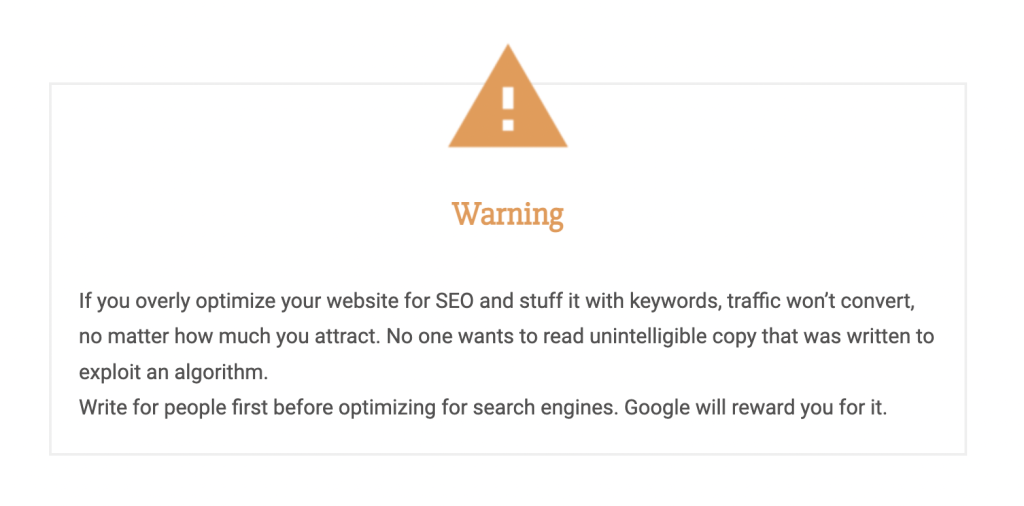
Your copy should also use emotional, action-focused language that connects with your target audience. It’s critical that you understand your ideal customer so you can use words that resonate and motivate them to take action.
2. Calls to Action on Every Page
A call to action (CTA) directs a user to take the next step and is essential to any website lead generation strategy.
You might have calls to action that instruct users to contact you, subscribe to your email list, download a lead magnet, follow you on social media, or visit a landing page. Which action you want them to take depends on how your funnel has been crafted.
Every page on your site should have a call to action telling visitors where to go next. Never leave your visitor wondering what to do after they finish reading.
It can be helpful to map out your CTAs to each page based on the different stages of your buyer journey using a flowcharting tool or even a spreadsheet. First, though, define what offers you have available for your prospect.
While some marketers believe that only a handful of key pages should have CTAs, most agree that at least most pages of a lead generation website should contain CTAs for the best results.

3. Lead Magnets
A lead magnet is a way to attract subscribers. It’s something you can offer for free (like premium content or special promotion) in exchange for their email address.
Lead magnets can be big, like a free ebook or a coupon. These freebies can be offered through a sidebar banner, sidebar form, or site-wide pop-up overlay. If you take a look at the top right of this page, you’ll see Fluxe has a lead magnet form for our Business Blogging Toolkit, which you can use.
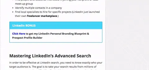
They can also be small, like a free-to-download content upgrade offered within a blog post. Content upgrades are extremely effective because you can create them to relate closely to the article, which means the reader is more likely to be interested in it.
Naturally, the more value you can pack into your lead magnet, the more likely people are to want it and give you their email address in return.
While you can create lead magnet content from scratch, it may be possible to repurpose existing content or even IP you use internally to create a lead magnet your audience will love.
4. Landing Pages
A landing page is a page with a specific purpose. It’s designed to get users to take a single action, like subscribing or purchasing. For instance, you might have a landing page that encourages users to enter their email addresses to receive your free ebook.
It’s smart to tailor a landing page specifically to your audience. It should have copy that appeals to that group with an appropriate call to action. For instance:
- An attorney would have a page for each type of service they provide.
- A software-as-a-service would have a page that compares it to each of its main competitors.
- A consultant would have a page to download their latest ebook.
Here’s an example of an excellent landing page by Uber. Notice the easy-to-understand language (“Drive with Uber”), benefits-based copy (“Earn money on your schedule”), engaging image, and clear call to action (the sign-up form).

Try using a content management system like WordPress (it’s free) with a theme. Depending on your budget, you can opt for a custom-designed website, or use a commercial theme and make your own basic customizations for a fraction of the price.
We recommend getting your themes from one of these sources:
- Thrive Themes — A comprehensive tool for all your lead generation needs.
- Divi Themes — An excellent tool to build custom pages.
- ThemeForest — A marketplace for website themes.
- StudioPress — Simple and lightweight themes (hosting too).
- Themify — Popular and inexpensive themes.
You also need a way to build calls to action and landing pages throughout your site. That’s best done using Thrive or Leadpages.
Finally, you need an email service provider to manage your leads and send content.
- Active Campaign — An excellent email marketing tool for new and power users. We recommend this service above others because of its wide range of features and affordable pricing.
- Drip — Perfect for simple, text-based emails and elaborate sequences.
- MailChimp — A good email marketing application for new users.
Lead Generation Goes Beyond the Website
Like we said, your website is only the beginning of your marketing funnel. Leads collected on your site should be captured by a customer relationship management tool, email marketing tool, or marketing funnel application.
The leads you collect on your website probably aren’t ready to buy right away, so you have to nurture them with additional content. Educate and engage your list. You might send a five-part email sequence on a relevant topic, or segment your leads into groups based on the content they consume.
Eventually, you need a process to approach these leads for sales. Set qualifications for a warm lead. For instance, you might decide that anyone who clicked a link to your product demonstration is warm. Once “warmed up,” that lead should receive a sales-focused automated email sequence or a personal message from a salesperson.
We know what you’re thinking: “This is a lot of work!” It seems laborious, but only to set up. Once you put your lead generating funnel in place, your only job is to create more magnetic content. The whole system scales seamlessly as you attract more users.
If you’ve already built out your lead generation site, you can achieve further optimization by A/B testing. While it’s outside the scope of this article, know that you can test each lead generation aspect of a website for conversion rates against other variations.
Sometimes that means changing the color or font of a clickable button, and sometimes it means switching up your copy to see which version gets you more clicks. You can learn more about A/B testing here.
Remember: A brochure is advertising. Nobody seeks advertising. If you want your website to play a role in your marketing strategy, it must be customer-focused, packed with value, and ready to collect and warm up leads, even while you’re sleeping.

