In January posted a list of our favorite small business Facebook pages that were using Facebook right titled: 17 Impressive Small Business Facebook Pages You Can Learn From. These were pages that were run by genuine local and small businesses without a big budget. We weren’t interested in big businesses that could throw money at their pages, we wanted to know how small business owners with limited time were using Facebook not just for the hype but to actually convert fans into profit.
We were overwhelmed by the response we got! We’ve received numerous comments saying how much it’s helped other small businesses and since then it’s become our most popular post. But then Facebook had to change the layout of the pages again and add the timeline. So we thought, what better excuse to update the list and see how small businesses are using their new Facebook pages.
This list not only covers 11 of our favorites but also, a description of each and exactly what we like about their strategy and approach to Facebook. Enjoy!
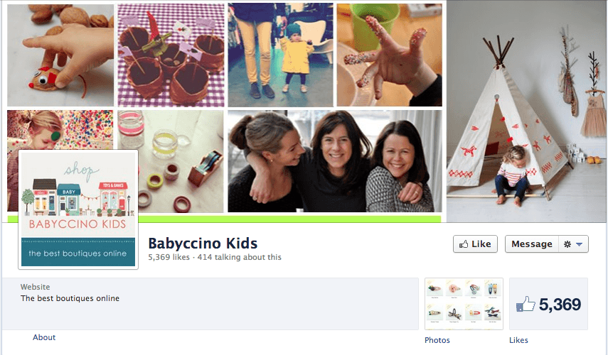
Babyccino Kids
The baby boutique Facebook page that has it going on.
What we like about it:
- They’ve showcased their clothes on actual kids in everyday life — Adds personality to their page.
- The conversations are consistent with the brand messaging all over their wall.
- You can really get a since of style while you’re scrolling down the page — Looks like a Pinterest board.
Companies like Babyccino Kids know what it takes to connect with their fans and potential customers on their Facebook page. The way they communicate can decide whether or not they get a sale, build an advocate and increase customer retention.
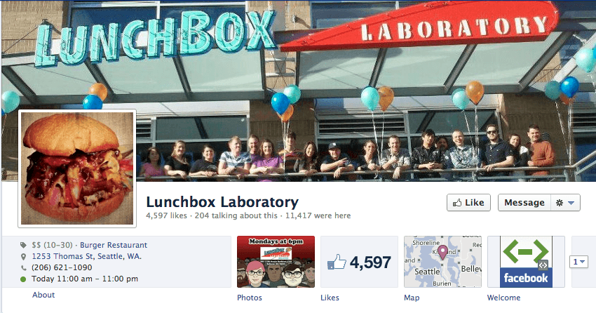
LunchBox Laboratory
A burger place that’s even brave enough to talk about Honey Boo Boo.
What we like about it:
- You have a sense of what you can expect when you walk in the door based on the style of their conversations.
- They are activily promoting events to get people in the door — You can see by the number of check-ins.
- Using popular memes is something Luchbox Laboratory knows how to do for their messaging.
We always like to see when a food business is honest and real with their conversation tone. If I were to go each at Lunchbox Laboratory today (which I want to) I already have a sense of the experience that I might have there.
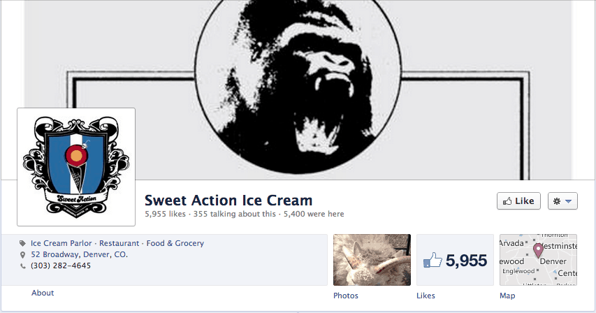
Sweet Action Ice Cream
An ice cream shop that can post a simple blend of ingredients and get 50 likes within an hour.
What we like about it:
- They may only have 6,000 likes, but their fan engagement is off the chart.
- Their messaging is consistent with what they’re known for — Great ice cream.
- The fans are trained to see each post of ingredients and get pallets watering just with a few words.
Sweet Action Ice Cream clearly knows how to cultivate and nurture a strong following of fans. By taking a minimalistic approach, they fans know what their getting and respond quickly.
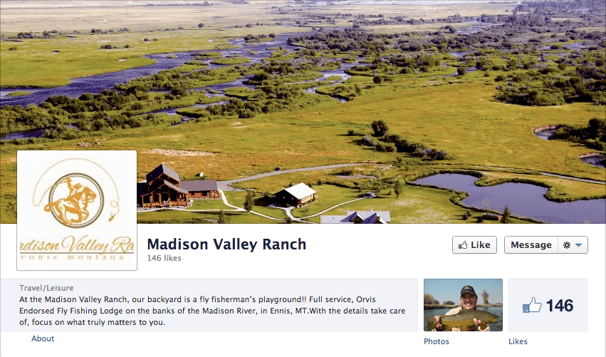
Madison Valley Ranch
The Ranch that utilized Facebook Timeline as is was meant to be used.
What we like about it:
- Madison Valley Ranch focuses on their clients and trips using a consistent photo approach.
- We love when brands are able to use their logo as the profile pic and a beautiful landscape photo in the background — Well done.
- They create photos and galleries with their posts that are easily sharable by clients.
Share good photos and share often. When you can harness a social media platform to connect with your clients, why not take advantage of it?
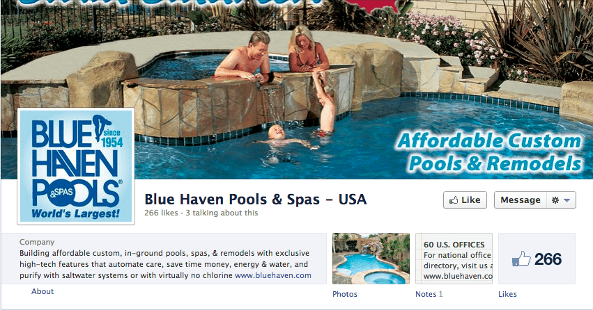
Blue Haven Pools
When content marketing is readily available, use it like Blue Haven Pools and Spas.
What we like about it:
- Blue Haven shares great content that is directly linked back to their website — Providing steady traffic.
- They’ve done a great job designing their profile photo and timeline photo to showcase their brand image.
- They use photos that are professional and draw you in with their design portfolio.
When you hear about Social Media affecting SEO, you see companies making that connection well like Blue Haven — Combining content marketing with their social platform while staying consistent.
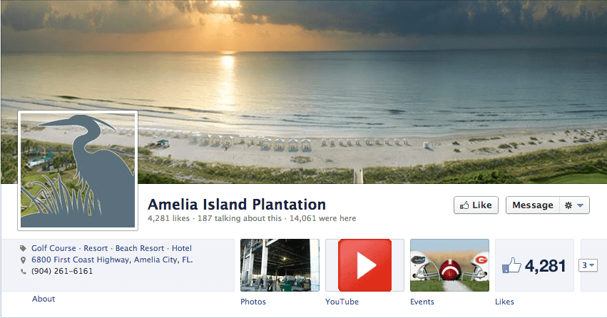
Amelia Island Plantation
Resort marketing is a tough task and these guys are doing it right.
What we like about it:
- They’ve made their page able to be checked-in on which has allowed for almost 15,000 check-ins.
- The event tab is actually updated with upcoming events and each event is linked to a Facebook event.
- Photos are being showcased for all parts of their resort including; new construction, events and leisure.
I’ve spent time marketing for a large resort like Amelia Island and I must say that their consistent communication and showcasing the activities and events is paying off.
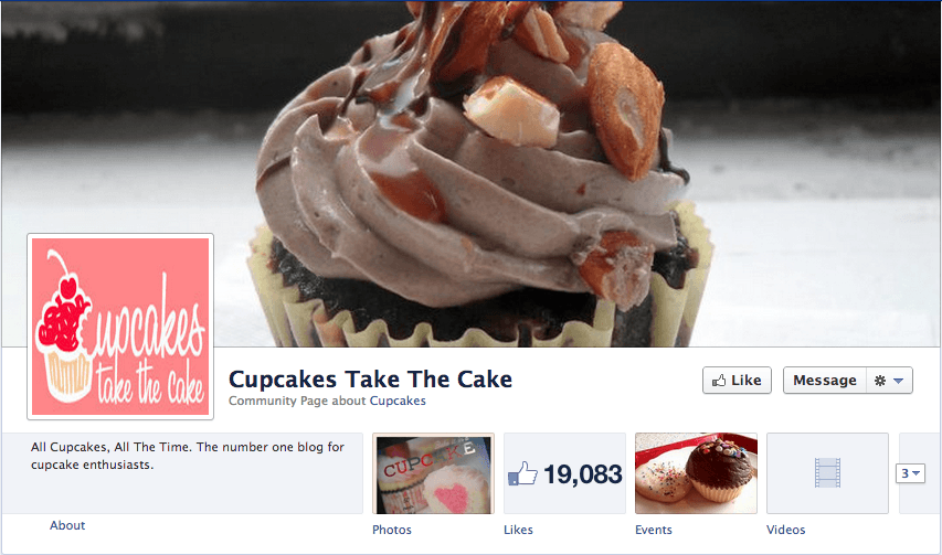
Cup Cake Take the Cake
The number one blog for cupcake enthusiasts may also take the cake on their Facebook page.
What we like about it:
- Cupcakes Take the Cake has successfully drawn their blogging fans over to their social channels.
- The constant posting from their blog allows them to use content marketing to the fullest.
- By regularly tagging other brands that they work shows a larger sense of community and collaboration.
Although the page is often posted to, it’s not annoyingly posting updates that people don’t connect with. Cupcakes Take The Cake is able to use the content from their popular blog and showcase each and every post on their Facebook page.
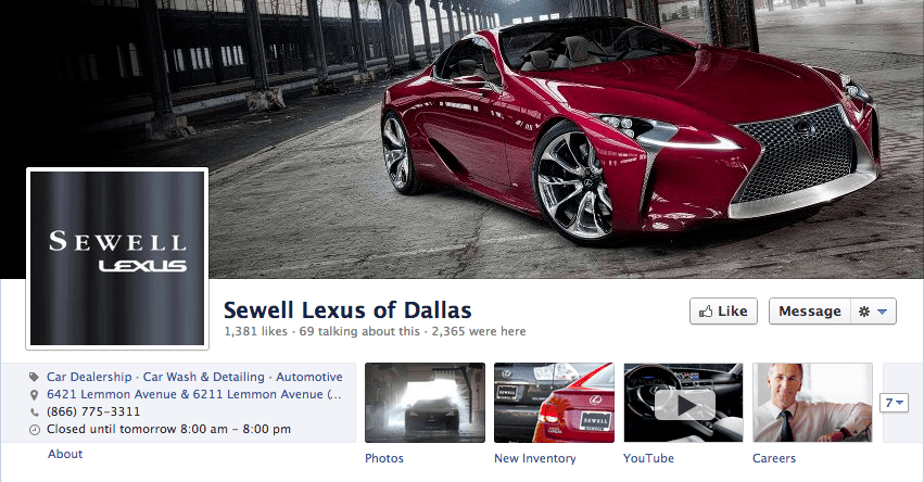
Sewell Lexus of Dallas
When a website doesn’t quite do it, create a Facebook page like these guys.
What we like about it:
- Their “New Inventory” tab is incredibly easy to use and allows the user to do a full search of their dream car.
- The amount of check-ins that their Facebook page is getting which means they’re promoting it well.
- They’ve create a close to website look and feel by utilizing the Facebook Tab function.
Once again, they’ve successfully transferred their website’s usability over to their Facebook page by creating a since of community and building in a “website navigation” using the tabs.
Power Yoga Chicago
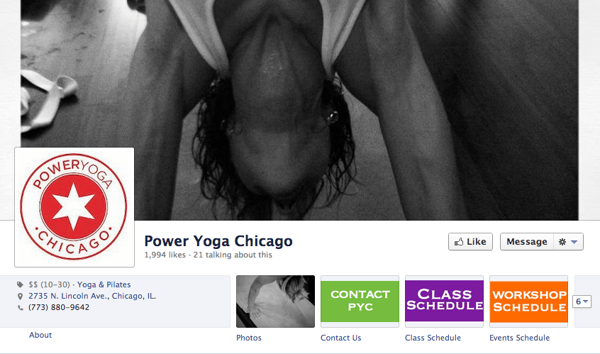
The use of navigation and a simple approach to displaying Yoga classes, these ladies do it right.
What we like about it:
- The amount of sharing from external sources and their own website seem to be evenly distributed.
- They keep the same style of posts consistent on their page which is pleasing to the eye.
- The use of navigation is color coded to draw your eye to the tabs on their page.
We feel that this page is all about conversion — They post in a nonchalant way which keeps people on their page and allows them to click on the colored tabs to either contact them or see the class schedule.
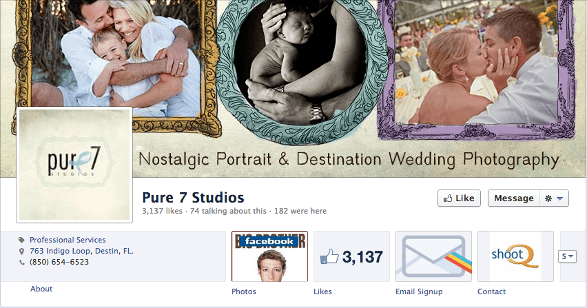
Pure 7 Studios
In order to get people to share your photos, post frequent and slap your brand on them.
What we like about it:
- Consistent usage of framed and branded images that enforce sharing to on Pure 7’s terms.
- The email signup through MailChimp is right at the top and ready for people to join the list.
- The occasional featured image on their timeline really pops on their page.
Many photography pages on Facebook struggle with the best way to communicate and share photos with their fans. Pure 7 Studios is a great example of how you can get your content shared by your clients and keep your branding consistent.
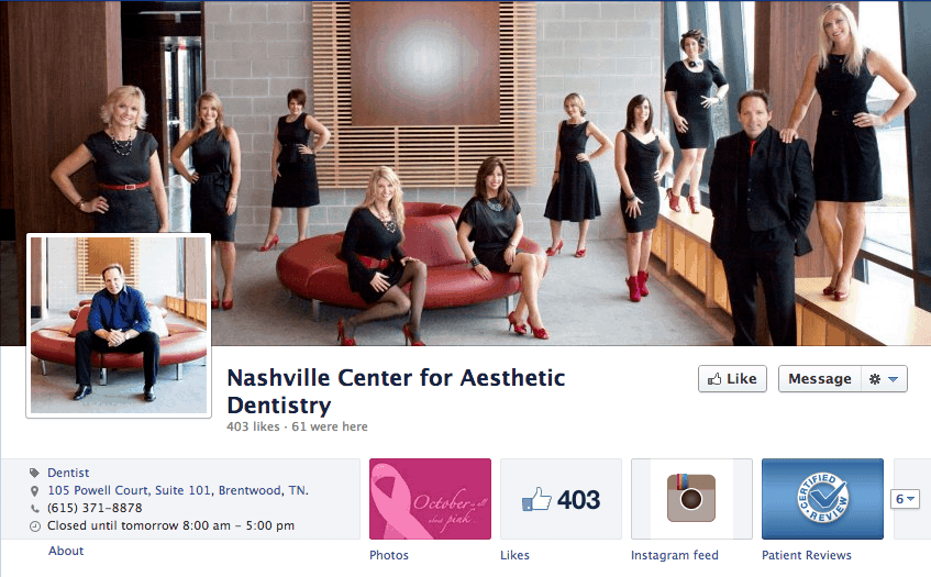
Nashville Center for Aesthetic Dentistry
When it comes to sharing who you are and why people need to use your service, these guys and gals nail it.
What we like about it:
- The use of the timeline cover photo and the profile picture couldn’t be better used.
- The brand uses external social tools such as Instagram to further engage their users..
- Patient Reviews in the tab help build some instant credibility and trust.
We’re big fans of actually showing your business reviews in the public as Nashville Center for Aesthetic Dentistry has done here. Great business can use this tool to win over clients…even on Facebook.
So there is our breakdown on Top Small Business Facebook Pages from the Fluxe team. Who would you add to the list? Make sure you tell us in the comments below!

